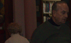
Here's a sample of what a section of the original photo looks like. This is how it came out of the camera. (Click the image to see a full-size version. Notice how grainy it is.) As I've said before, the ideal thing would be to take better photographs in the first place. A camera that just does better in low light would be good, for instance. In this case, it also might have helped to take the photo in a different part of the building, but I wanted a photo of the punch stand, and it was set up in just about the darkest part of the library, barring a closet. (The building is an old Carnegie building, and this is the part they barely touched when they remodeled in 1990, because it's near the beautiful historical dome. So no lights were added. It looks fine when you're standing there, but it's not so good for photographs.)
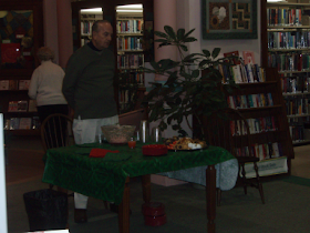
Also, I might have gotten slightly better results if I'd moved closer and used less zoom, but I had to take the shot when I could get it, because there were cookies on the table, and most of the time I'd have gotten shots of several people's backs. So this is the photo I've got to work with. Oh, here's a scaled-down version of the whole thing. This is, again, mostly just like it came out of the camera, except for being scaled down.
The image is a bit dark, so naturally the first thing I did was to take the levels tool and lighten it up. I discussed this step in more detail before, so I won't belabor it again now. The result looked like this.
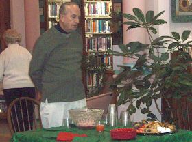
The image is easier to see now, but if we stop here we've almost done as much harm as good, since the poor quality of the image is also now entirely too easy to see. The image is blotchy with apparently random blobs of strong color -- green, blue, red, purple, ... ick. Scaling down will help (click the image to see how much worse the full-size version is), but I'd like to clean it up a little if possible before I scale it down. So I thought maybe I'd try a despeckle filter. Despeckle is designed for much milder damage than this, but I thought I'd see what I could make it do.
I tried adaptive and/or recursive despeckling, but on an image this bad they scarcely have any impact at all, so ultimately I had to turn off those options. This is unfortunate, because it creates blur, but when an image is this badly speckled, a little blur can actually be better than the alternative.

So this is a sample of what I managed to get out of the despeckle filter. It's a bit disappointing, and if I were a real graphics artist I could probably have tweaked the numbers a bit and got something slightly better, or known which other filter to use and how to apply it, but I'm just a network administrator trying to wear an extra hat, so this is what I managed.
I was tempted to scrap it at this point.
However, I've learned that when you're trying to clear up artifacts, like speckles, from an image, sometimes what doesn't look so good on its own can be useful in combination with the original image, by using one of the various layer blending modes. Of course I had run the despeckle filter on a separate layer that was a copy of the previous image, so by changing the blending mode and adjusting the opacity, maybe I could salvage something yet.


I tried several different blending modes, but I'm only going to show you the ones that I thought worth keeping. Here it is (on the left) with the despeckled image in overlay mode with an opacity of 65%, over the (non-despeckled) lightened image. And here it is (right) with the despeckled image in screen mode with an opacity of 33%, overtop of the version with the 65% overlay, overtop of the lightened image.
The screen and the overlay have different effects, and in this case the one was effectively muting some of the speckles out of one part of the image, and the other was de-emphasizing the speckles in other parts of the image, as well as making the image overall lighter. So I combined those effects, and at this point I did my first scale-down, to 1536x1235 (a factor of the original size), using of course the bicubic interpolation. I also cropped the image slightly, which got rid of the big white thing at the left (which is actually the edge of a rectangular pillar, which is really pink not white, but nevermind).
I hadn't noticed originally, because of the other issues that the image had, but by now it was obvious that I was going to have to do something about the man's red eyes. Generally what I do in cases like this is take the lasso tool and select the most egregiously red parts of the eyes, copy, paste, make it a separate layer, desaturate it, and then turn down the opacity until it looks as close to natural as I can get.


If you want to get elaborate you can also recolorize the eyes, especially if you know what color the person's eyes are supposed to be, but in this instance, especially at this scale, I didn't deem that step necessary. Gray is good enough here.
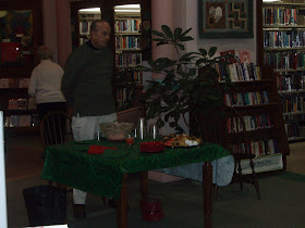
Finally, I brightened the image up a little using the technique I discussed before, lightened that back up a bit (using levels), noted that the effect was still too strong, turned down the opacity on that layer (letting the previous, unbrightened version show through partially) until I thought it was about as good as I was going to get, scaled it down (bicubic interpolation again) one last time to 512x412 (a factor of the previous size), and this is the result:
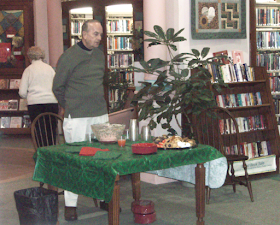
Okay, it's still not a terrific photo, but compare it to the original:
You're definitely on the right track with the layering. For redeye, I generally just use the sponge tool, set to desaturate. A bit more precise, and you can use a variety of brushes. I also don't bother with despeckle much; I've never been too happy with the results. Have you tried gaussian blur?
ReplyDeleteThe trouble with gaussian blur is that it can also blur things you don't want blurred, e.g., facial features. Sometimes I've used it with a layer mask, though, or taken the eraser tool with a soft-edged brush to the blurred layer, and for some photos that can create reasonably good results.
ReplyDeleteBut you're right, the results of the despeckle filter are seldom anywhere near as good as I'd like. There's that particular type of speckling that digital cameras tend to give you under poor lighting conditions, which you can definitely see in this photo, and the despeckle filter generally doesn't do a very good job of cleaning it up. If anyone knows of a really good way to do so...