I recently mentioned the technique of using an unsharp mask to brighten a dark image, and someone asked me how "sharpening" can compensate for underexposure. This post is an attempt to explain. First, I should note up front that it's better to get a good clear photo in the first place. For the example, though, I have chosen one that is, in a word, not. The end result would be a bit better if the starting photo were a bit better, but using a really poor photo makes it easier to see what is going on, so for the sake of example, that's what I'm doing. This photo was taken using a cheap old consumer-grade digital camera. Here it is in mostly undoctored form: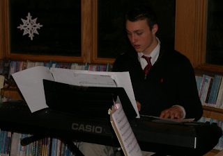
I say mostly undoctored because I've cropped it. The curious can see more of the context here (this is part of the second photo there), but this much will do for the sake of explanation.
When a photo is terribly dark like this, the first thing most of us want to do (assuming we don't want to just throw it out) is lighten it up. There are various ways to do that, each with advantages and disadvantages (brightness/contrast, gamma correction, channel curves, ...) but the method I usually use in this kind of situation is the levels dialog box. (I'm using Gimp here, but other photo editors presumably have something similar.)
This photo was so underexposed, a significant band of values at the bright end was entirely unused in the original. So I brought the rightmost of the three sliders left to the point where the graph tapered off into nothing. Additionally, the darkest values are over-represented (note the giant spike on the left side of the graph), so I dragged the middle slider to the left a bit in an attempt to compensate. There is, however, a limit to how far you can go with this. After a little experimentation, these are the positions I ended up with: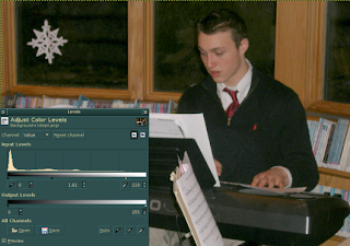
The color is now rather dull, especially in the background. It was dark, and we've lightened it a bit, but lightening it too much more would wash it out. Instead, at this point I opted to use the unsharp mask filter. Again, I'm using Gimp, but other photo editors (well, ones serious enough to have filters) probably have something similar. Note that I ran the radius up to 50 pixels: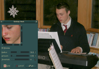
With a small radius (the default in Gimp is five pixels) the unsharp mask exaggerates changes in color across short distances, which helps blurry edges to seem sharper (though, technically, they aren't actually made sharper as such). With a larger radius like this, though, the changes in color are measured, and exaggerated, over larger distances. Rather than picking out edges, this picks out whole areas of the photo and makes them seem more distinct from one another. This has an overall brightening effect, making the colors seem bolder. Again, it can be overdone, but this image really needed it. Look at the difference in the woodwork around the windows from the image above to the one below. The snowflake also now looks white instead of dingy gray.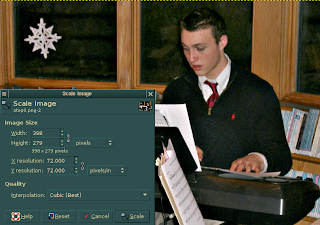
Finally, this image, in addition to being dark, was also rather grainy. Fortunately, it was taken at a larger resolution than I needed for the web, so I was able to solve this problem simply by scaling it down to a factor of its original size. Note the use of the cubic interpolation: chintzier scaling algorithms like nearest neighbor are not recommended, as they can actually exacerbate image quality problems. Here is my result: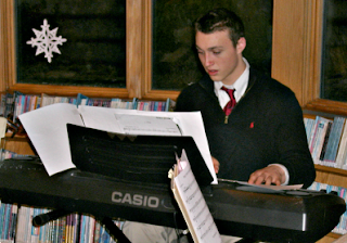
It's still not the best photo ever, but if you scroll back up and look at the original again, you will notice how much worse it was. This really is an improvement. Of course, starting with a better photo initially will yield better results.
Human Trust of AI Agents
1 day ago

0 comments:
Post a Comment